Powys Health Charity

Powys Teaching Health Board
Branding

Background and brief

Powys Teaching Health Board’s charity was established to safeguard any donations made to the Health Board and NHS services within the Powys area. Its charitable aims are to support the health and wellbeing of NHS staff, volunteers, patients, and community members primarily as a grant distributing charity.

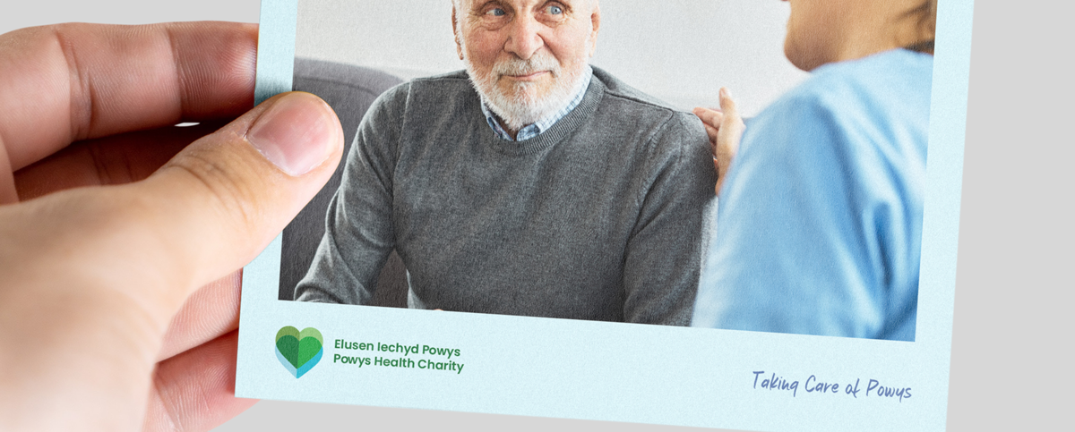
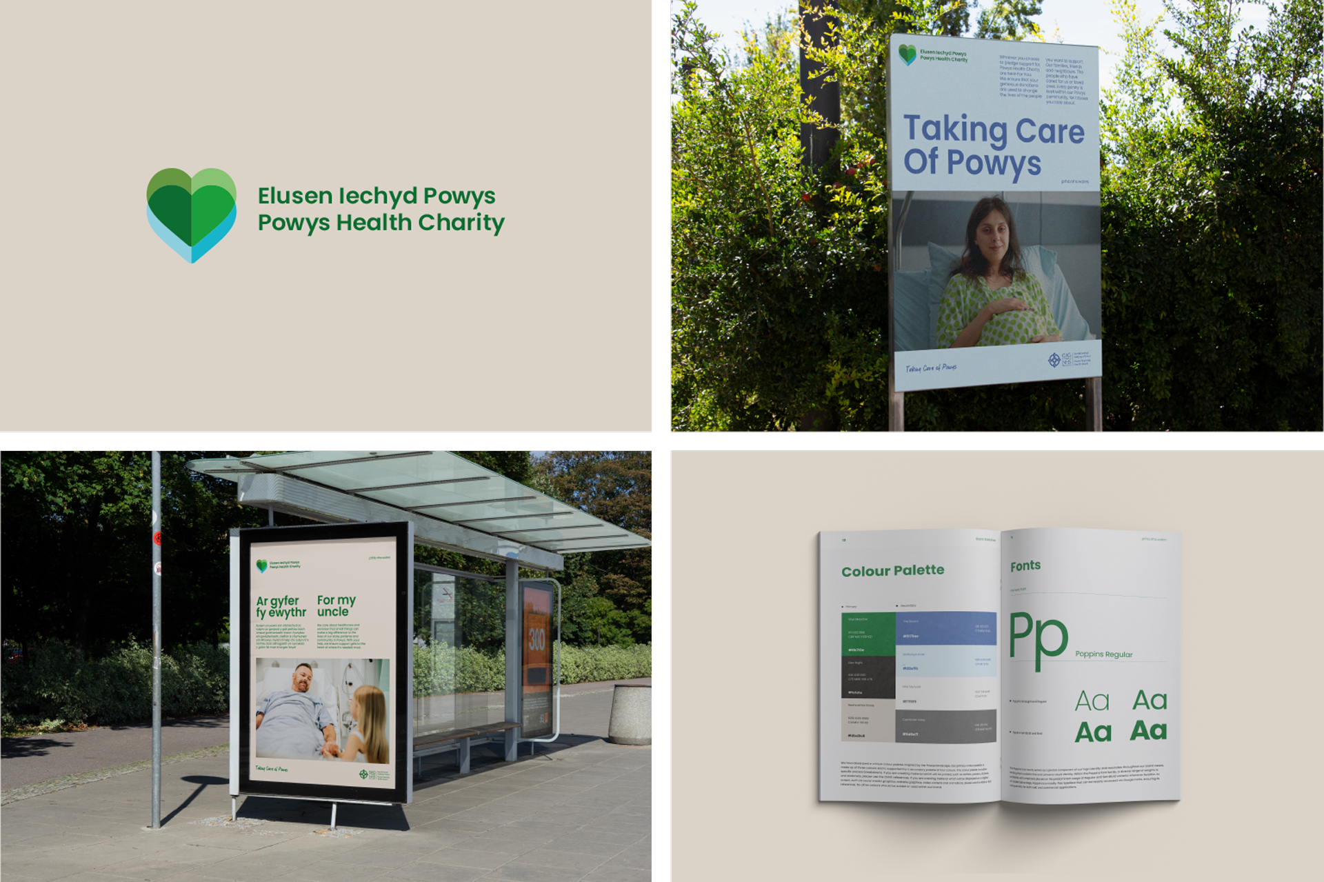
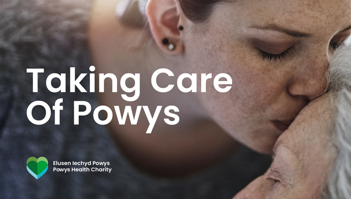
jamjar was commissioned to develop a brand identity that would engage with people living and working in Powys and stand out within the competitive charity space.

Research and insight

As the team dissected the brief and conducted desk research, we quickly discovered that most of us weren’t even aware that every health board in Wales has a charity, so there was an education challenge on our hands, as well as a branding one.

The initial brand workshop with a cross-section of stakeholders demonstrated that even those working alongside the Charity struggle to articulate what a health board charity is. We challenged their thinking, asking them to focus less on what the Charity does, and more on why it exists.

In the words of one our workshop participants, the Charity “provide the extra level of care that the NHS isn’t able to provide – for Powys”.

We also discovered that, wherever possible, the Charity offers donors the rare opportunity to decide exactly what their donation is used for.

Brand strategy

“Taking care of Powys” became the strapline that signed off every piece of communication from the Charity, succinctly articulating why the Charity exists.

Every project or donation led with who the donation was for, rather than a list of services or equipment provided, as the Charity had done previously. For Dad. For Brecon. For the nurses who looked after Sian.

The concept of care became the consistent thread across every brand touchpoint, from the logo device and colours, to the imagery and language. Powys was inevitably at the heart of everything we produced, as this was a brand for Powys, by Powys.

Brand development

The final logo comprised of a unique heart graphic inspired by the distinctive Powys geography, with the shapes and colours reflecting the mountains, lakes and reservoirs. The intersection of the two hearts also represent the integration that exists between communities. We established a tone of voice that felt as warm and personal as the Charity, ensuring that all communications were akin to how people within Powys speak to one another.

It was vital that photography showed people and projects in Powys in every instance, so we are working with the Charity to develop a suite of imagery and content for use across marketing collateral and social media.

Client feedback

jamjar were able take our ideas and the important things like the values and vision for our Charity and bring it all to life in the brand. There was a lot of feedback from all sorts of stakeholders during the brand development workshops, and with their experience they knew exactly what to add, tweak and change to build a brand that could be for all of Powys.

Throughout the creative process, we could feel the team’s enthusiasm for the project and I think that extra care shows in the final brand. We’re so pleased with the results and proud to be able to share this new brand with our colleagues, patients, and the community every day. We’ve had the most amazing feedback so far and there’s no doubt the new brand is helping us to reach more places, do more for our community, and help more people across Powys. Diolch yn fawr!

Related work

Mermaid Quay

Midsomer Norton

Cowbridge Festival of Flowers

National Forest for Wales

Vaccination Saves Lives

More case studies