Morris Brothers

BrandingWebsite Design
Tenby Coast Website Material Morris Brothers Project

Background

Morris Brothers was established in 1866 when three brothers opened a shop in Tenby. Initially an ironmongery, it wasn’t long before household goods, fishing tackle and sporting equipment were added to mix. In 1939, Frank and Francess Lewis bought the business and there are currently over 16,000 lines of stock as the company continues to evolve. Still owned by the Lewis family today, Morris Brothers has become a well-loved Tenby institution and famed for its first-class customer service. Katherine Lewis, Managing Director, says the secret to long term success is that “we pride ourselves on listening to our customer’s needs.”

The brief

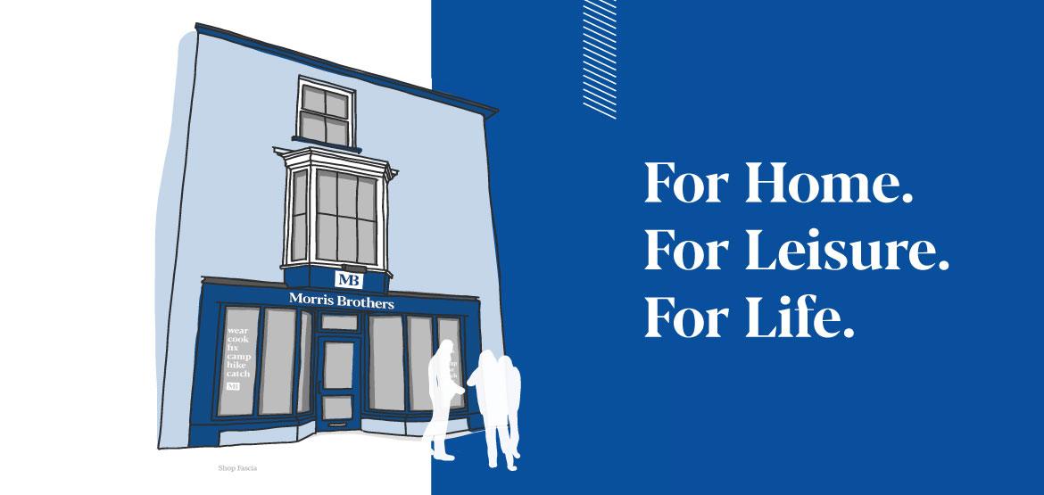
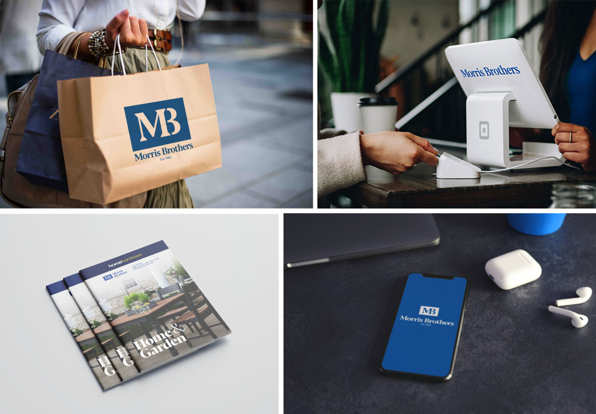
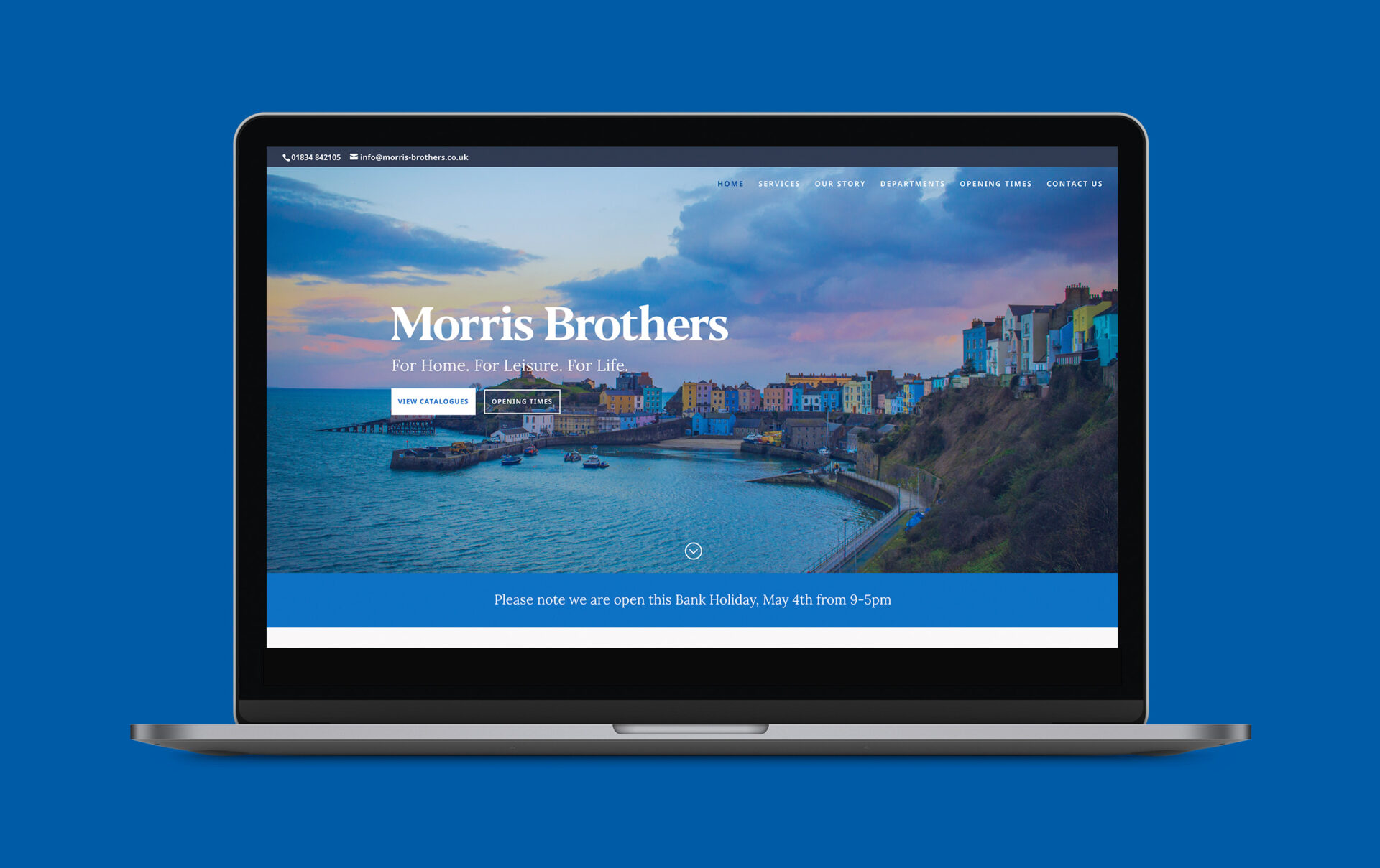
We were approached by Morris Brothers to update their brand with a contemporary feel whist ensuring there was still a nod to its rich heritage. The requirements included updating the following:

  • Logo
  • Shop front signage
  • Website

Development 

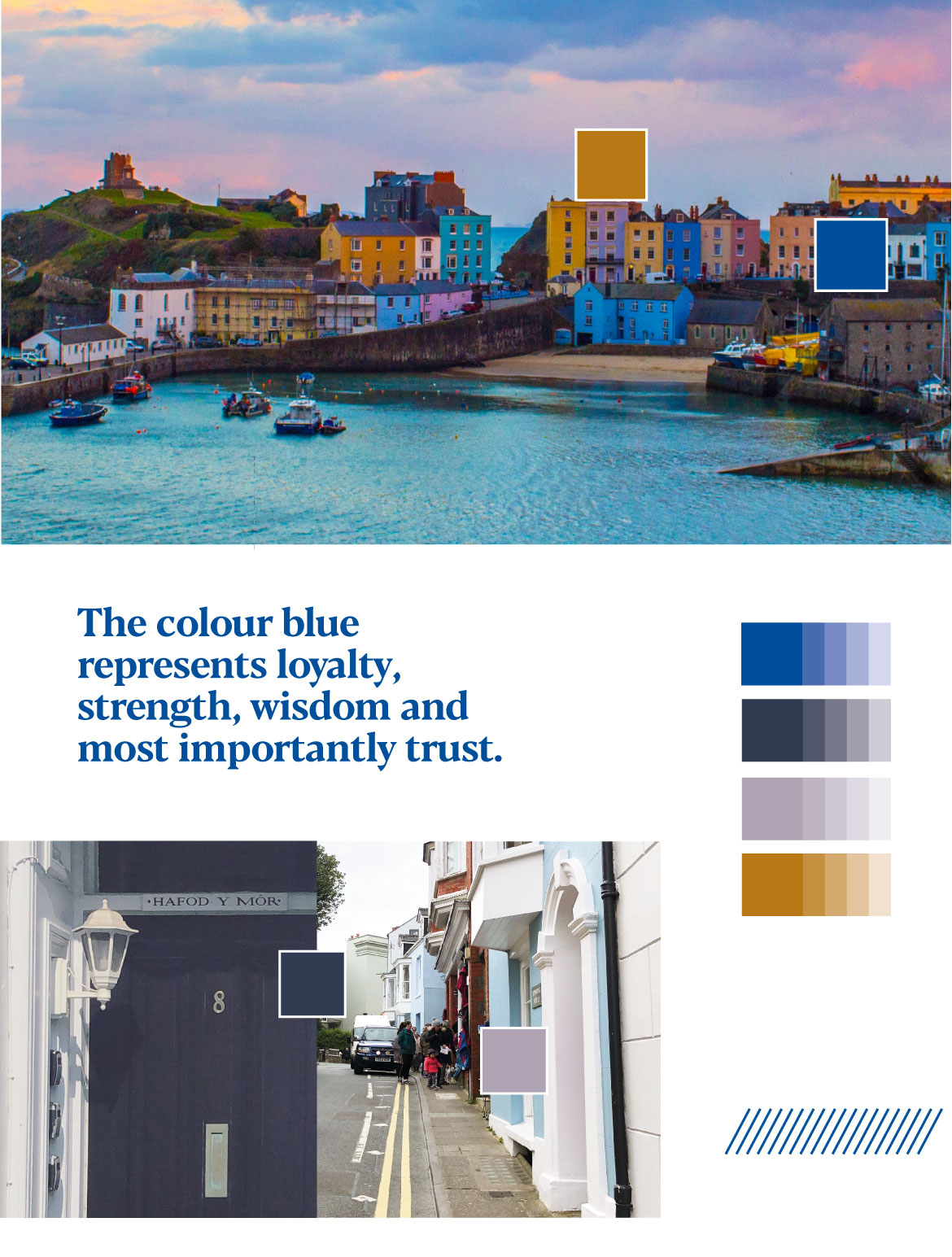
As part of our research we carried out a survey with existing clientele of the shop and discovered there was huge awareness of the Morris Brothers history. It was very clear from the survey that the steadfastness of the company was crucial in its retention of customers; the word ‘trust’ was very much synonymous with Morris Brothers.

Logo History Creation Process Morris Brothers Project

Branding

The people and town of Tenby have always been at the heart of Morris Brothers and so we wanted to make sure that the sense of trust and respectability that the brand had nurtured over the years resonated though the brand refresh. We based the logo around the architecture and typography that you can find in the historic streets of Tenby, a lot of which has been a mainstay in the local community since the 1860s. We were also able to use an original ledger for inspiration and incorporate it alongside all the other historical elements of the store and town. The word mark encapsulates the vision and values that were set out out for Morris Brothers at its creation, but also brings a more contemporary feel to it so that it ties in with the vision of the Morris Brothers of today and the future.

The word mark, which is the primary logo, has unique and distinctive font characteristics which reflect the essence of Tenby, but it also creates a recognisable mark for the brand which new and returning customers will be able to identify clearly with Morris Brothers.

Rebranded Logo Creation Morris Brothers Project

To elevate Morris Brothers distinctive identity, we  produced a symbol that sits in stacked forms. The logo, with or without the symbol, has been designed to be flexible which means it can be adopted for use in many different formats and across various brand touch points.

Rebranded Colour Palette Morris Brothers Project

Environments and Touch Points

Rebranded Shop Front Morris Brothers Project

To maximise the footfall on the high street we visualised the new shop fascia to entice people into Morris Brothers. With space limited, we used the logo on the main sign area, the symbol above and some key explanation graphics on the windows either side to ensure the whole brand was identifiable in a quick glance for a passer-by.

Rebranded Merchandise Morris Brothers Project

Website

The existing website needed to be updated to reflect a more contemporary vision, whilst still maintaining Morris Brothers important heritage . The website also needed to maximise the engagement of online customers with a clearer end-to-end customer journey.

We designed the new website to be responsive and its content easily digestible to users. Content was presented in a more modular way and a consistent tone of voice was introduced across all the pages to make the online customer journey seamless and undeniably on-brand throughout.

Website Creation Homepage Morris Brothers Project

Related work

Gileston Manor

Mermaid Quay

Midsomer Norton

Powys Health Charity

Cowbridge Festival of Flowers

More case studies