Good Food & Movement

BrandingCampaignDigitalGraphic Design & Print
Good food & movement hero banner

An overview to tickle the tastebuds

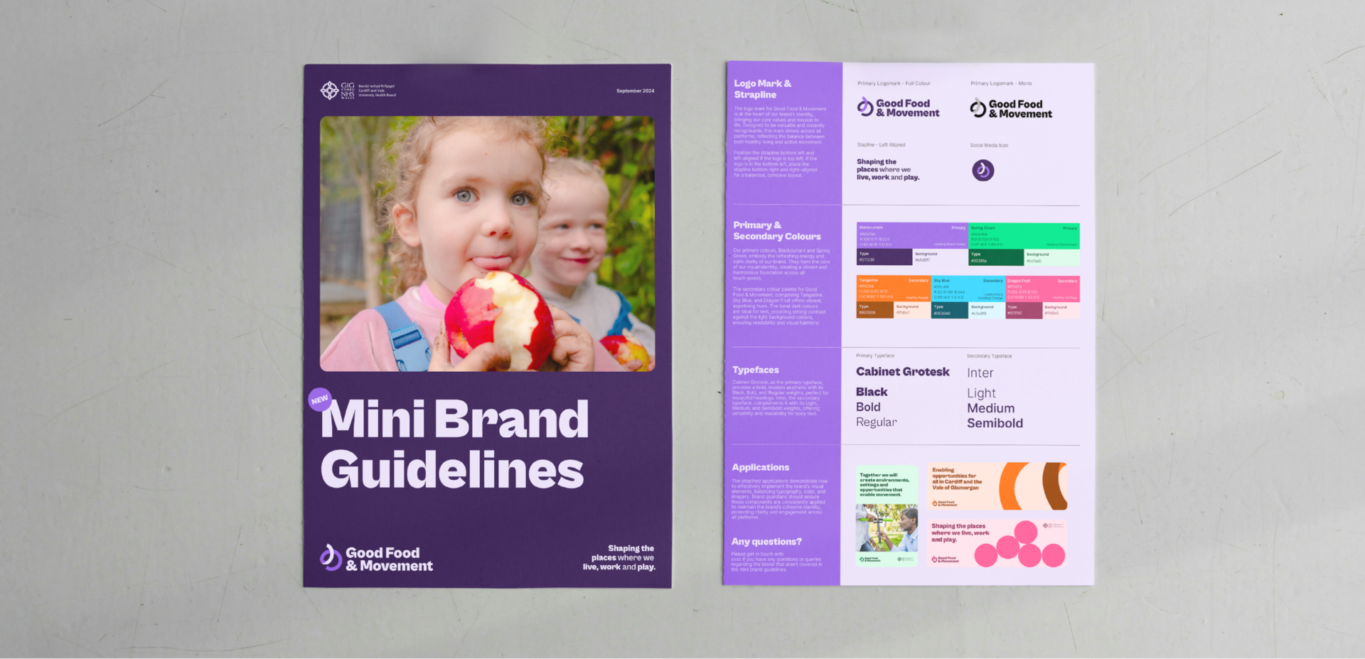
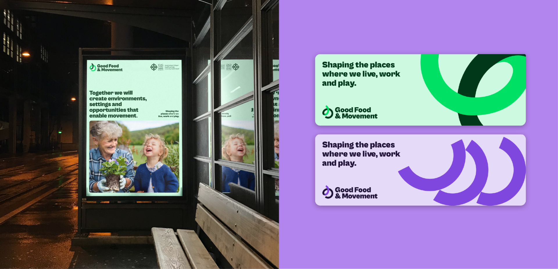
Cardiff & Vale University Health Board (UHB) commissioned jamjar to evolve its established Move More, Eat Well brand. The goal? To refresh and reposition the brand to better reflect a strategic Whole Systems Approach – shifting the focus from individual responsibility to environmental and systemic enablers of healthier lifestyles. The result was Good Food & Movement – a fresh, credible brand identity developed collaboratively with partners across Cardiff and the Vale to unify, inspire, and drive long-term change.

Lifting the lid on the brief

With a new strategic framework on the horizon, Cardiff & Vale UHB sought to review and refresh the Move More, Eat Well brand to ensure it was fit-for-purpose. Widely recognised but seen as outdated and overly simplistic, the original brand needed to evolve to better reflect the complexity of the challenge and the broad coalition of partners working together to support healthier communities.

The brief required:

  • A refined brand identity to align with the Whole Systems Approach.
  • Exploration of a new name and strapline.
  • A more credible, unifying visual identity for use by partner organisations.
  • Development of core assets, brand guidelines, and content to support implementation.

Our recipe for success

jamjar took a strategic and collaborative approach to rebranding:

Stakeholder engagement:
We led workshops with key stakeholders to explore the role of the brand, assess its strengths and limitations, and test new naming, language and design directions. Insights from these sessions shaped every stage of the creative process.

Brand naming & positioning:
Following feedback, we proposed a new name – Good Food & Movement – and strapline – Shaping the places where we live, work and play – that better reflected the project’s environmental and collective focus.

Visual identity development:

  • Logo marque: Inspired by the people-focused illustrations of the original brand, the new icon uses abstract shapes to convey movement, connection and inclusion – core themes of the programme.
  • Colour palette: We retained and refined the original vibrant colour palette to preserve recognition while improving cohesion and clarity.
  • Application: The new identity was designed to flex across digital and print, large-scale campaigns and partner toolkits – from social icons to full-bleed graphics.

Brand toolkit:

To ensure successful rollout, we developed comprehensive brand guidelines, commissioned photography to bring the identity to life, and created a suite of adaptable communication assets for partners.

Proof is in the pudding

Key results included:

  • Clarity & credibility: A bold, refreshed identity that positions Good Food & Movement as a trusted, strategic programme.
  • Unified voice: A brand that connects a diverse mix of partner organisations under a shared vision for healthier places and communities.
  • Stronger recognition: An evolved colour system and flexible icon ensure consistency while enhancing visual impact.
  • Stakeholder ownership: A collaborative process that built buy-in from the start – with partners describing the new brand as something they feel proud to champion.

Related work

Valleys to Coast – ‘I’m In’ Campaign

Swansea University Event Services Brand Refresh

Vale of Glamorgan Food & Drink Producers Directory

Connect Magazine – Sony UK Technology Centre

Vale of Glamorgan Council – Placemaking

More case studies