Background
Public Health Wales (PHW) is the national public health agency in Wales and exists to protect and improve health and wellbeing and reduce health inequalities in Wales.
The brief
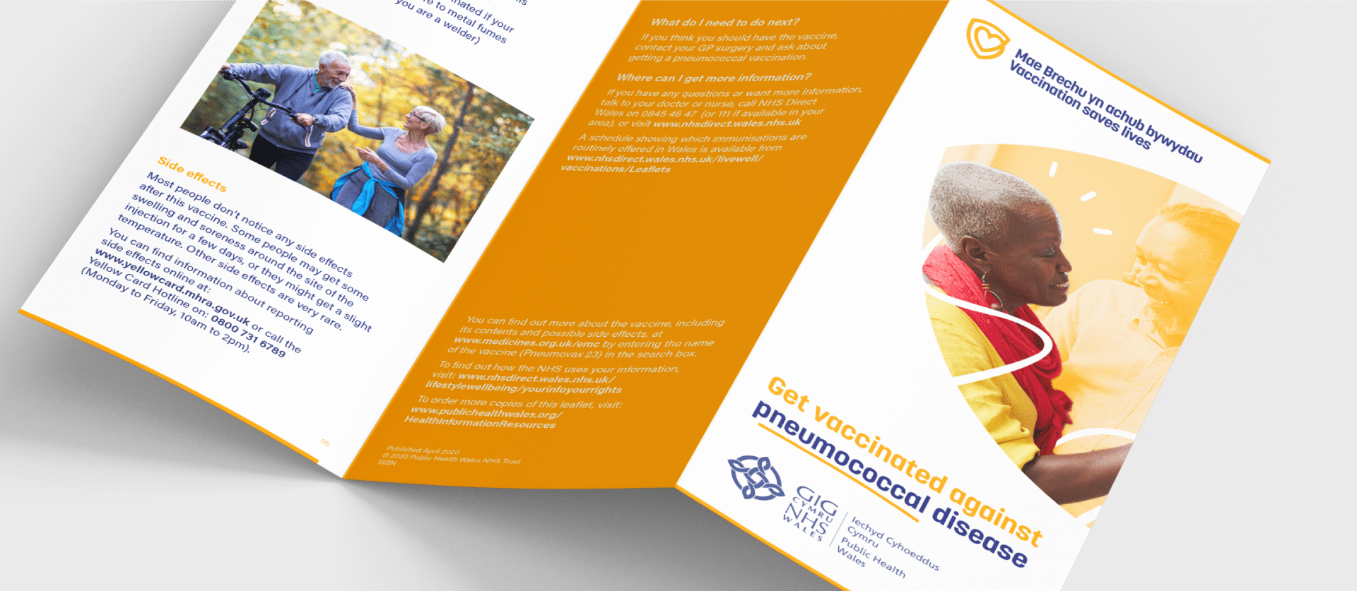
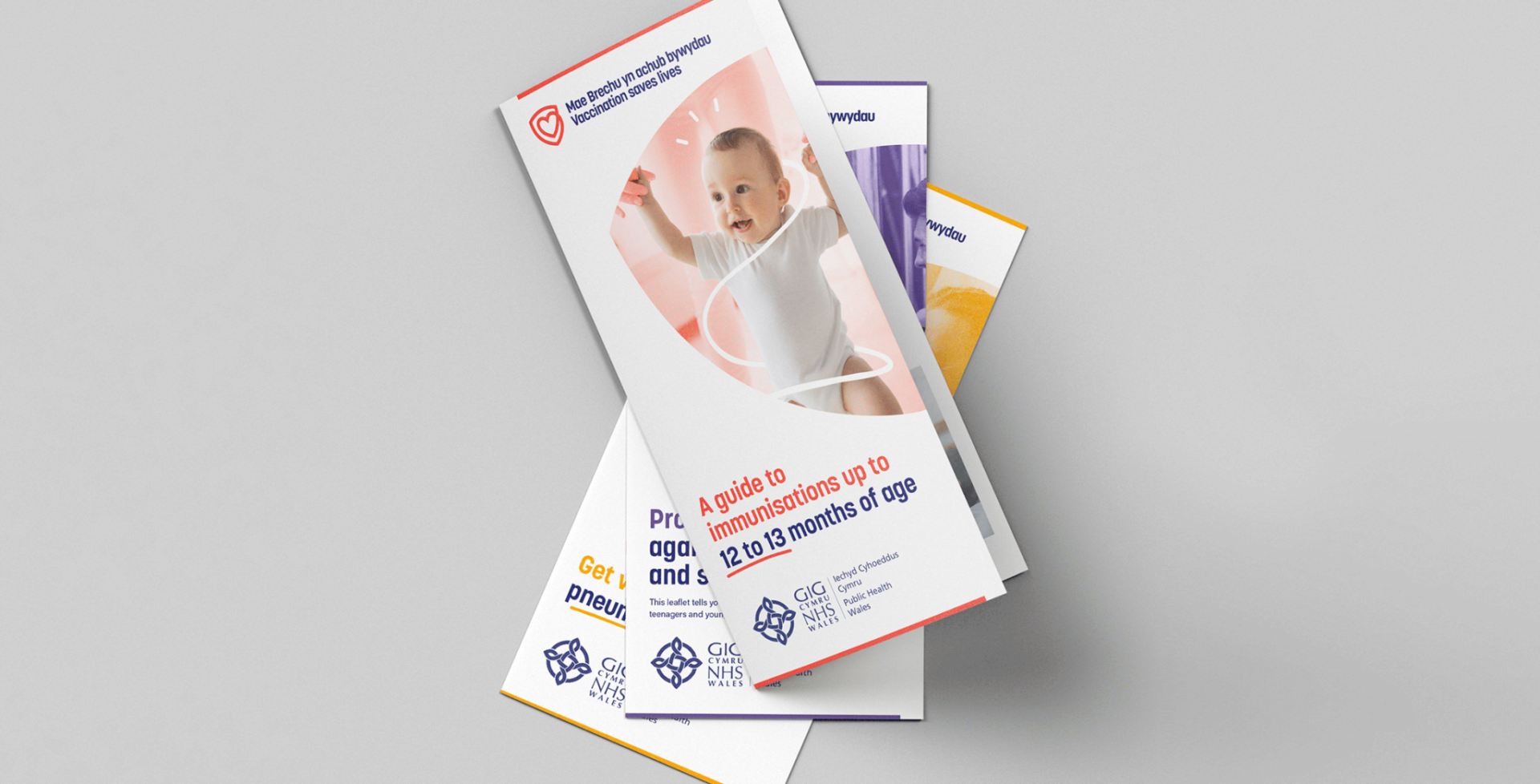
Following a competitive pitch, jamjar was commissioned to develop a strong and recognisable bilingual visual identity for use in all immunisation resources and assets produced by PHW.
Immunisation programmes are one of the most successful public health interventions globally. The World Health Organization (WHO) estimates that 2-3 million lives are saved every year worldwide through immunisation.
Public confidence and trust are critical to the success of these programmes and the communication materials the public view has a direct impact on this.
Our brief was therefore to create a visual identity informed by research, behavioural science and public engagement, which is viewed by the target audience as being trustworthy, authoritative, contemporary, fresh and engaging.
What we did
Research
As with all our branding projects, phase one involved a lot of research. We quizzed the health professionals at Public Health Wales on the types of immunisations and the benefits of vaccinations; we looked at what other health organisations were doing in a similar field; we looked at survey results from PHW and insight from the World Health Organisation about barriers to immunisations and how to maintain trust in vaccinations; we surveyed our target audience on their perceptions of immunisations and much more.
Thorough research at this stage gave us strong foundations to build the visual identity from.
Concept creation
Armed with our evidence from the research phase, we set about developing visual concepts which we felt best fitted the brief.
Having undertaken several behavioural change campaigns on behalf of health organisations, we used this insight to ensure the concepts were influenced by behavioural science, as well as design psychology.
We worked up two firm concepts which we then tested amongst our target audience. We established a testing panel which included an even cross-section of people across Wales who fell into the following categories: expectant parents, parents of babies, parents of toddlers, parents of teenagers and over 55s.
Secondly, we used two anonymous groups via an online survey platform who were 1) parents and 2) over 55s from across Wales.
We asked them lots of questions on the concepts we developed gaining their feedback on which resonated with them the most, which they trusted the most, which colours stood out if they resonated more with photography or illustrations, and much more.
Using the findings from our public engagement, we were in a position to develop our final concept.
Logo identity
The chosen logo identity incorporates a heart and the letters ‘B’ (Brechu) and ‘V’ (Vaccinations) within a shield to represent the protection provided by immunisations. It also includes a strong strapline ‘Vaccination saves lives’, designed to portray the significance of immunisations.


