What we did
After delving deeper into the facilities, offering and audiences at the Sports Park, three initial logo concepts were created for the client to review, each with a slightly different take on the brief. Following consultation with the client and wider partners, one identity was chosen to develop further.
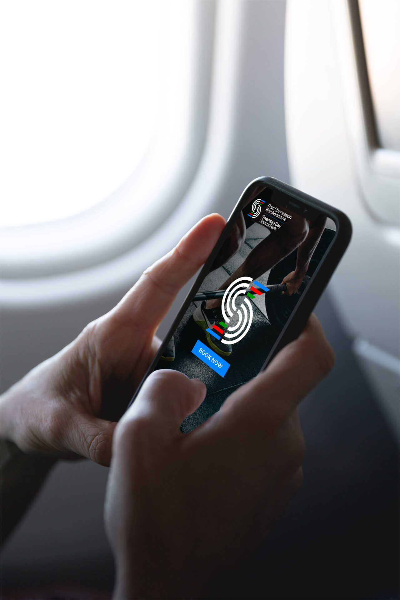
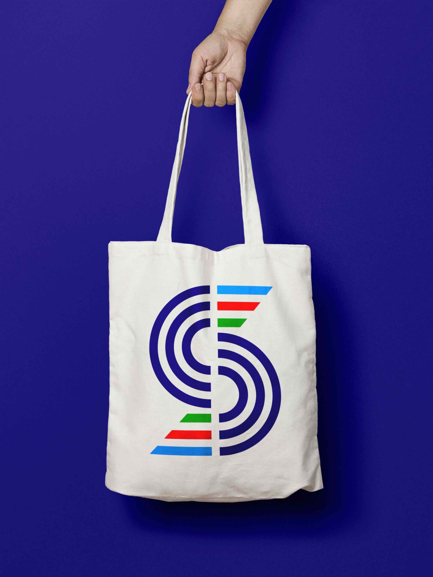
The chosen identity was inspired by the location of the sports park taking the curves from the
coastline of Swansea Bay. The curves were mirrored, and a horizon line was added to provide a focal point for the eye. The lines were then connected through right angles to make up the shapes from the venue’s name – SBSP from Swansea Bay Sports Park and PCBA from Parc Chwaraeon Bae Abertawe. The interconnecting lines within the icon also helped to unify the three facilities and marry up their audiences. The curves and shapes also helped to visualise direction, movement and the customer journey and could be used as graphical devices to support the brand. To complement the icon, a bold and bright colour palette was chosen to align with the brand colours of Swansea City Council, Swansea University and Sport Swansea.
During the development phase, we experimented with different typefaces, colours and orientations, before refining the chosen identity and applying it to mock ups so the client could get a real sense of how it could work in context.