#10for10 | Visual Identities

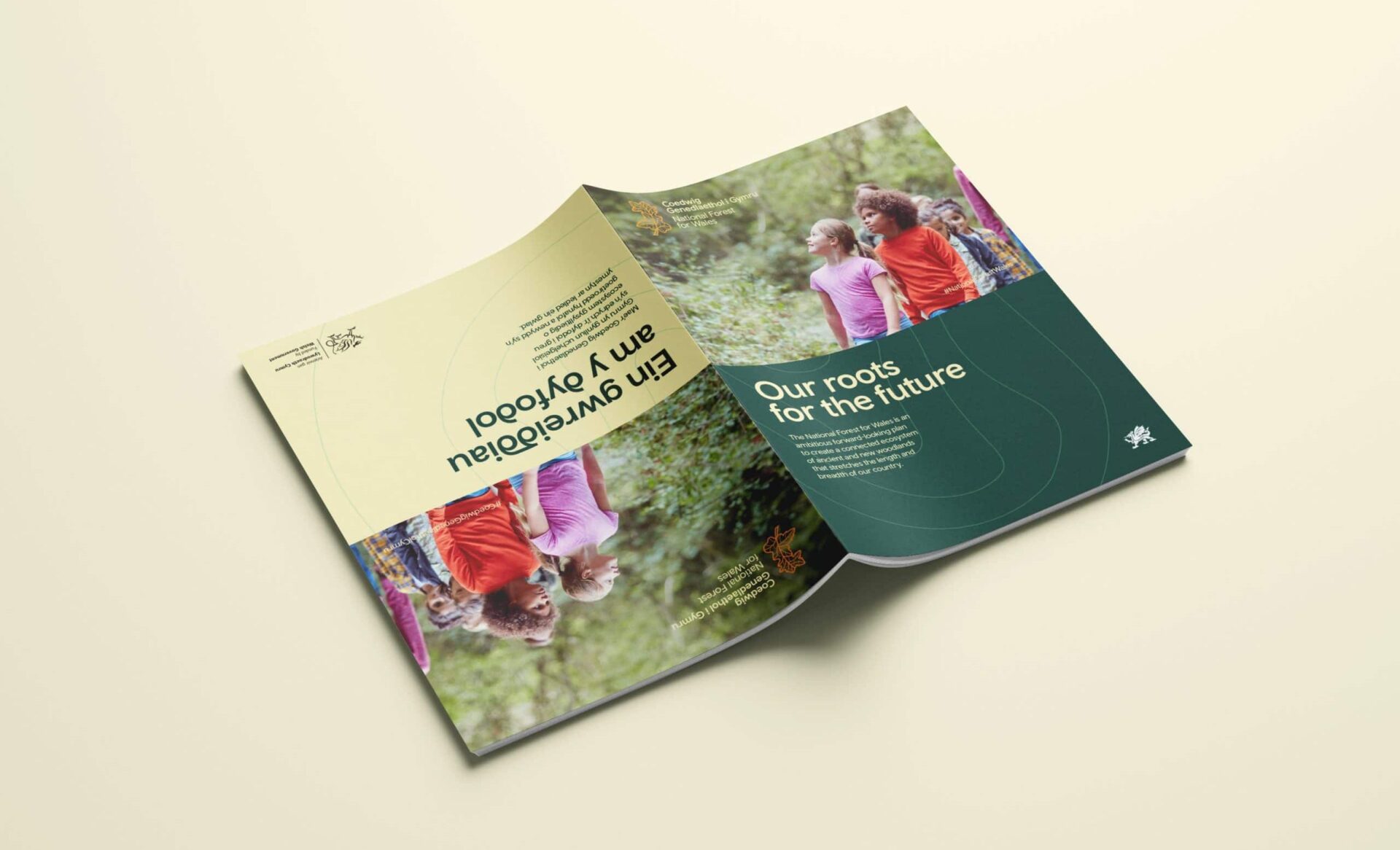
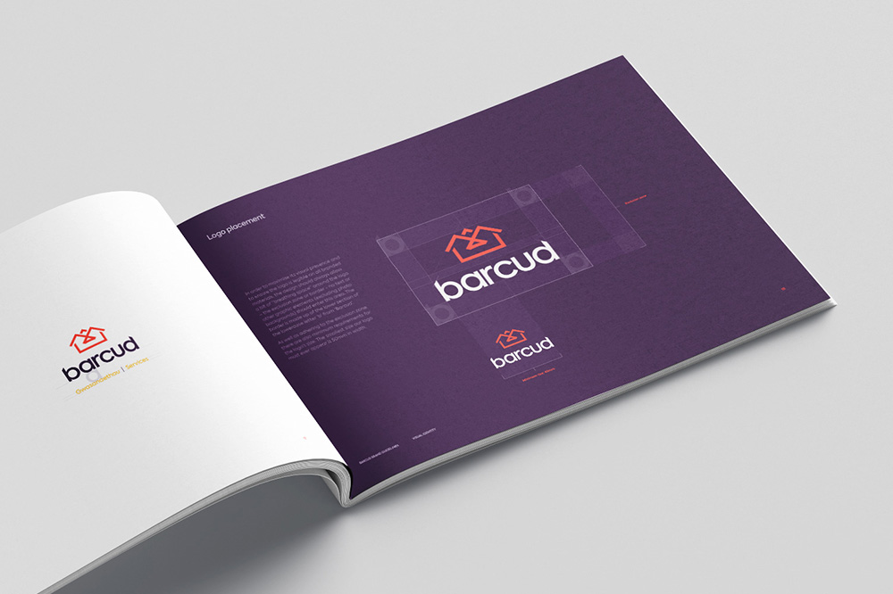
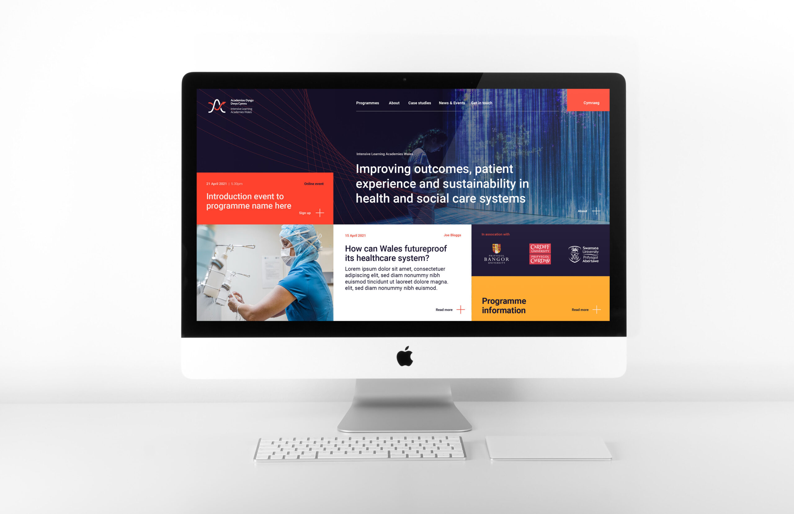
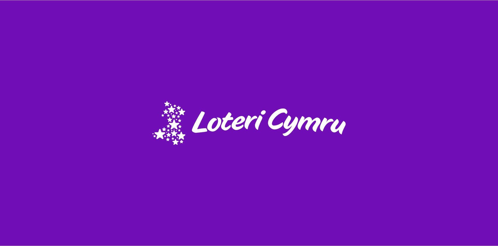
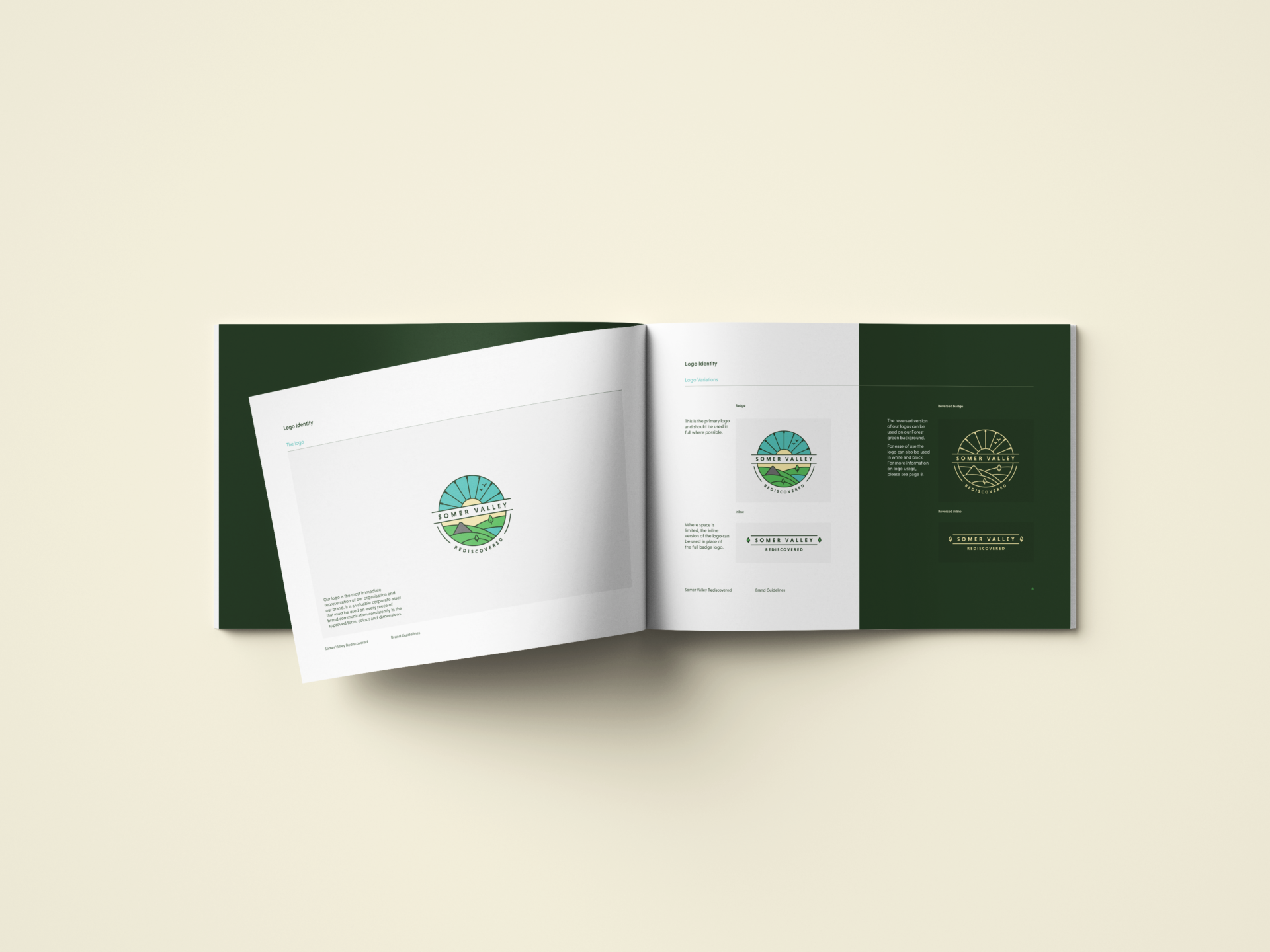
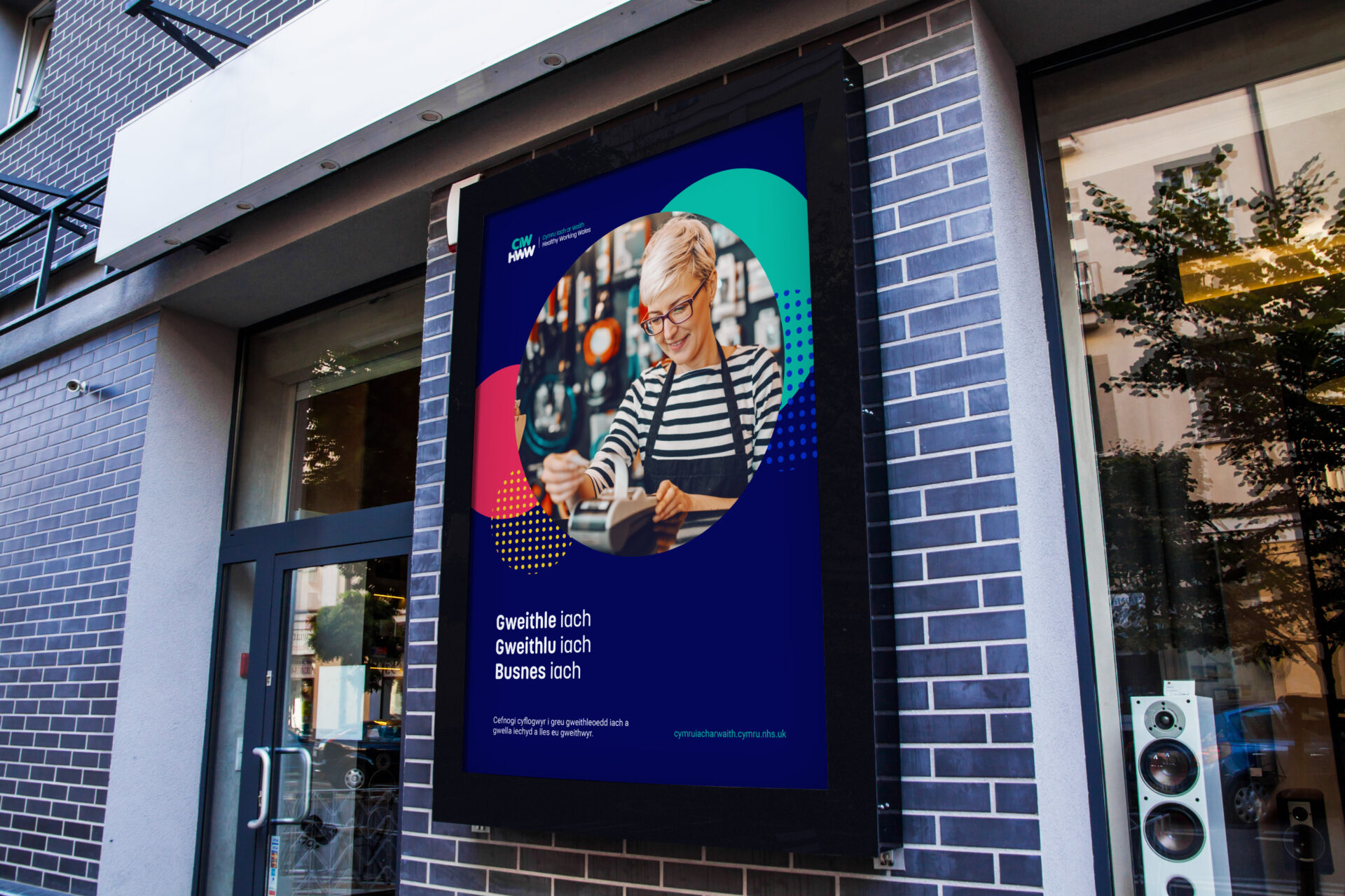
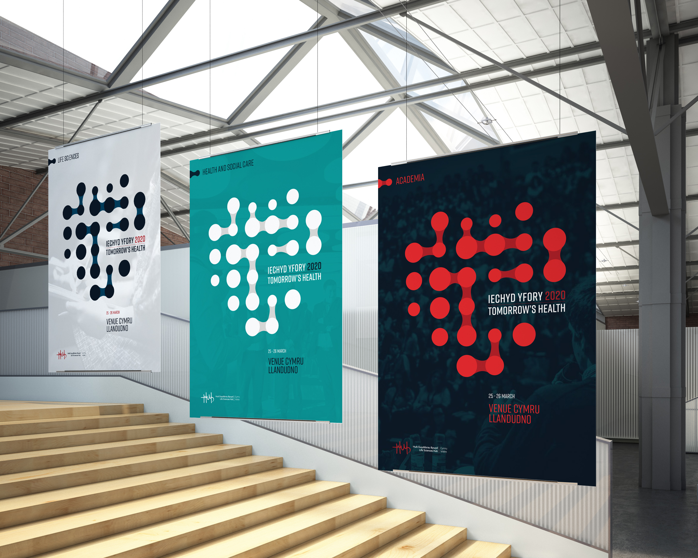
We continue our #10for10 campaign as part of our tenth anniversary celebrations with our top 10 favourite visual identities created over the last decade.

We love nothing more than bringing brands to life with a strong identity and we’ve worked on so many bold designs over the last 10 years…so much so it was difficult to choose our favourite ten, but we whittled it down and here they are:

National Forest for Wales

In March 2020, Welsh Government announced its intentions to create a National Forest. The National Forest for Wales will run the length and breadth of the country through a connected ecosystem of ancient and new woodlands.

jamjar was commissioned to create the National Forest for Wales’ new brand along with a set of communication assets which would help communicate its benefits.

Our brief was to create a bilingual brand which would engage and inspire, be distinct and recognisable, and be easy to apply and understand.

The final logo features the recognisable outline of Wales made up from various types of leaves found within Welsh forests. The interconnecting lines/veins within the symbol symbolise how the National Forest will stretch the length and breadth of Wales and connect our ancient and new woodlands. Here’s a link to find out more about this project.

Barcud

Following the merger of Tai Ceredigion and Mid-Wales Housing as ‘Barcud’ a new, bilingual identity was needed for the brand.

The brief was to work with an internal focus group made up of staff and tenants to develop a fresh and exciting brand and visual identity including a logo, fonts, colour palette, imagery, styling and tone of voice.

We achieved a full roll out of the new brand identity across touchpoints including digital assets, website, clothing, signs, and vehicle livery, and had both positive feedback from staff and tenants alike. Here’s a link to find out more about this project.

Intensive Learning Academies

In collaboration with Cardiff, Bangor and Swansea University, Life Sciences Hub Wales established Intensive Learning Academies Wales (ILA), the umbrella brand, for three new programmes helping to transform the delivery of health and social care across the globe.

We were commissioned to develop a new brand for the ILAs which was forward-looking, inspired by healthcare innovation and rooted in Wales. The project included the development of a visual identity and a brand toolkit which included a suite of assets for use across print and web.

The visual identity and associated assets are now being used by universities across Wales to market these world-leading academies. Here’s a link to find out more about this project.

Loteri Cymru

Loteri Cymru is the all-Wales lottery, which was created to raise vital funds for charities in Wales. For just £1 a week, people in Wales can try their luck of winning the £25,000 jackpot, while at the same time helping to raise money for charities in Wales. We were tasked with developing a vibrant and playful new look for the brand. The identity included the development of a new logo, colour palette, photography and graphical devices.

Brand Development Project Swansea Bay Sports Park Logo Signage

Swansea Bay Sports Park

jamjar was commissioned to develop a logo and visual identity for Swansea Bay Sports Park. It needed to be influenced by the Sports Park’s location in Swansea Bay and work alongside partner logos – Swansea University, Sport Swansea, Wales National Pool Swansea, and Swansea Council.

The final identity features a strong symbol inspired by its Bay location and influenced by the facilities on offer (running track, waves, court lines). Three core lines and colours feature to represent the three main partners and three main audiences (professional athletes, students, local communities) and the icon is capped off by an angular protrusion to symbolise progression in a person’s fitness journey. Here’s a link to find out more about this project.

Logo Identity Somer Valley Project Brand Guidelines Book Inside

Somer Valley Rediscovered

Somer Valley Rediscovered aims to better connect communities to their local greenspaces tackling both biodiversity loss and improving health and wellbeing. We were commissioned to create a logo identity for the project and a short explainer animation to bring to life what it is about. The emblem logo we created uses the simplicity of singular lines to represent recognisable landmarks and the environment of the area. It includes the rolling hills and valleys, the batch, the mining heritage (mining wheel) and the old coal canal. The curves of the sweeping hills of the Valley were used to create graphical devices to feature across marketing collateral. Here’s a link to find out more about this project.

Healthy Working Wales

Healthy Working Wales (HWW) is a Welsh Government programme delivered by Public Health Wales that works with employers and other partners to create healthy workplaces and improve the health and wellbeing of the Welsh workforce. Our brief was to develop a new visual identify for the programme, together with a suite of supporting communications materials.

The project included the development of a logo identity, designed to attract and appeal to businesses of all sizes and from all sectors in Wales, and a range of resources to encourage businesses to embed health and wellbeing approaches within their workplace. Here’s a link to find out more about this project.

Tomorrow’s Health

We were commissioned by Life Sciences Hub Wales to develop a brand and communications resources for its event – Tomorrow’s Health – which would bring together healthcare professionals, businesses, and academia for the first time in Wales.

Taking inspiration from the event’s aim of connecting these three distinct audiences, we developed a unique logo identity which used interconnected, kinetic style dots to visualise how these audiences needed to work together to inspire innovation and shape the future of health in Wales.

Midsomer Norton

Through our framework with Bath & North East Somerset Council, jamjar was commissioned by Midsommer Norton Community Trust and the Cultural Consortium to develop a new brand for the town, Midsomer Norton, to celebrate its distinctive local character and heritage and to help showcase the town’s cultural offering and events.

As part of the brand development, we hosted a workshop with stakeholders to find out about what makes Midsomer Norton unique. We used these findings and our own research to create a suite of decorative tiles which showcased what the town had to offer.

A selection of these tiles were arranged to create a logo identity arranged to resemble the town hall’s window panes, and the wider suite of tiles are used as graphical devices. A primary colour was developed, together with a secondary palette for seasonal events.

Dragon’s Heart Institute

Cardiff & Vale University Health Board commissioned jamjar to develop a brand for its Dragon’s Heart Institute – a collaboration and innovation space which exists to find radical solutions to the nation’s biggest healthcare challenges. The brief was to create a clear, engaging and inspiring brand which makes a strong first impression.

We created a visual identity featuring a Celtic inspired Dragon’s head logo, vibrant colour palette and suite of graphical devices. As well as the visual identity, we created the essence of the brand – its rationale, proposition and vision – to give the brand its foundations for the future. We then created brand guidelines and a suite of assets to help communicate the Institute to its global audiences.


If you’re looking to bring your brand to life with a new identity, please get in touch we’d love to jam with you.