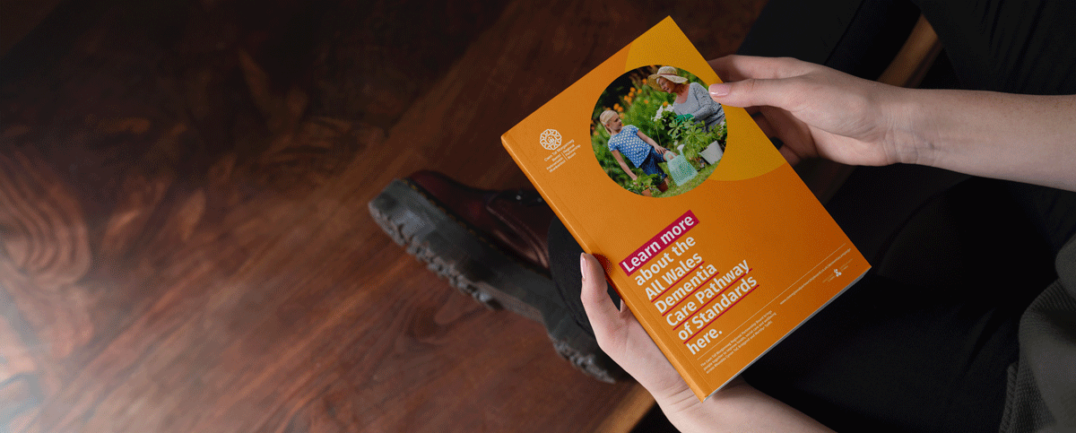
Background
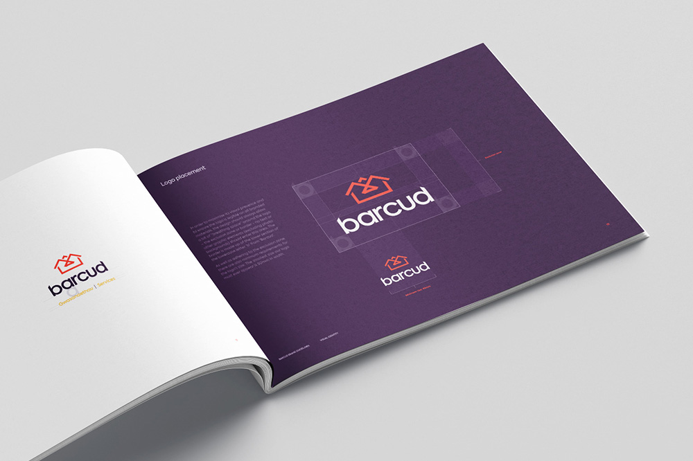
Following the merger of Tai Ceredigion and Mid-Wales Housing as ‘Barcud’ a new, bilingual identity was needed for the brand.
Brief
To work with an internal focus group made up of staff and tenants to develop a fresh and exciting brand and visual identity including a logo, fonts, colour palette, imagery, styling and tone of voice.
Objectives
The new brand identity included a visual and a verbal identity which needed to:
- be aspirational and innovative in the way it portrays the organisation.
- portray confidence, quality and belonging and be instantly recognisable for ‘what we do’ and ‘who we are’.
- be seen as a bold player in the housing sector in Wales by merging identities, merging vision and merging associations.
- be fully bilingual
- have tenants at the heart of every decision
Strategy
We wanted to develop a visual identity was that would be distinct, memorable, relevant and easy to apply in the real world. In terms of the verbal identity, it needed to work equally well bilingually as well as being personal, empathetic and succinct. Both elements of the branding drew on the history of both Tai Ceredigion and Mid-Wales Housing as well as using the local area and its notable features as inspiration. Setting up consultations at progressive stages of the creation process was key in ensuring that stakeholders (Barcud staff and tenants) were able to provide their personal feedback at each stage of development.
What we did
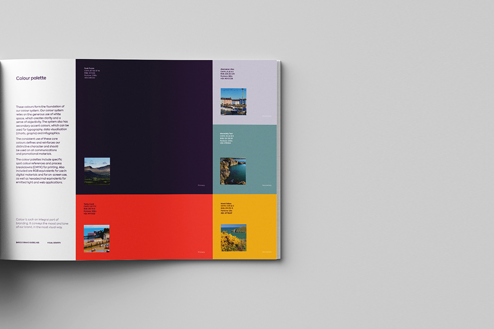
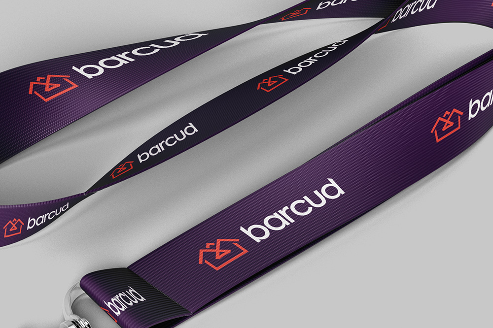
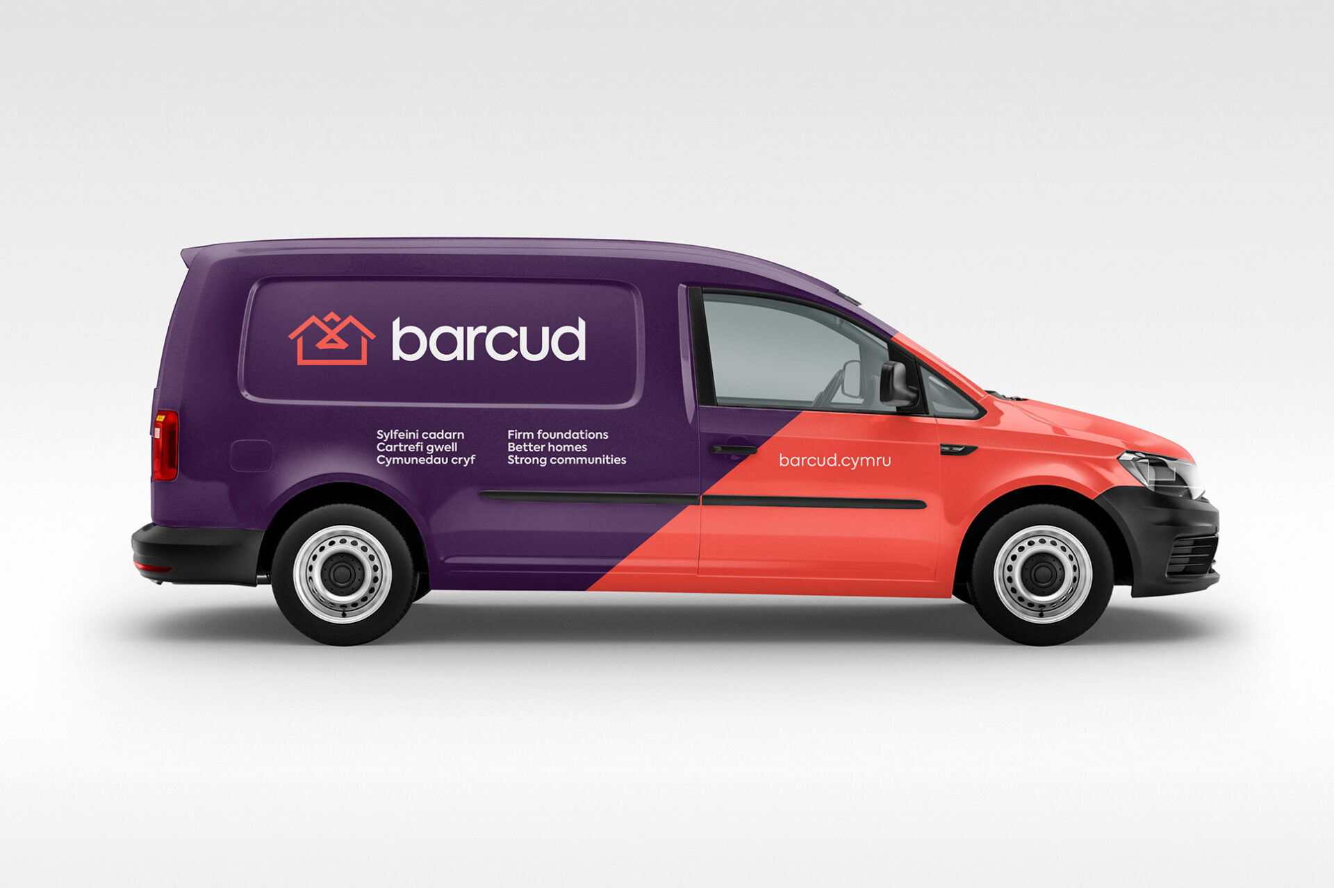
Different logo, strapline and colour concepts were created for the client to review in the consultations, each with a slightly different take on the brief. Following these consultations one identity was chosen to develop further. The final identity featured a strong symbol and strapline and were chosen for their representation of key brand elements such as foundations, homes, community and the local red kite.